• Financial Services
  • SaaS
  • B2C
  • Corporate
  • OnSite/Remote
  • My Responsibilities

  • UX design
  • UX Research
  • Low-Fi Wireframe, Prototype
  • Cross-functional Collaboration
  • Usability testing
  • Collaboration Teams

  • Business Stake Holders
  • Product Manager
  • Marketing team
  • Visual Designer
  • Mobile App developers
  • Design Tools

  • Sketch App
  • Abstract
  • Zeplin
  • Figma
  • Marvel
  • Research Tools

  • Google Workspace
  • Google Analytics
  • Firebase
  • MetriX
  • Porsline

About Company

Fanap is an Iranian information technology corporation owned by semi public Pasargad bank financial group.
Pasargad Bank is a well-respected and highly influential bank in the country, known for its commitment to improving banking services and enhancing the quality of life for its customers. The bank's focus on the well-being of citizens and its efforts to keep pace with global advancements have made it a leader in the industry.

In response to the sanctions, Pasargad Bank has taken a proactive approach to meet the daily needs of its customers. The bank has partnered with its subsidiary, Pasargad Electronic Payment Company, to launch a project called "Pod Smart Land" or simply "Pod."

What is Paypod?

Pasargad Electronic Payment, with its expertise in managing electronic payment services, with various products catering to B2B, B2C, and B2G markets, including web, app, and POS solutions, has developed innovative solution streamlines and enhances the payment process a comprehensive digital payment application.

The aim of this project is to simplify daily tasks and improve the overall experience with digital payments by eliminating the need for cash, and making it easier for people to complete their daily tasks and have a positive impact on their lives through efficient digital payments.

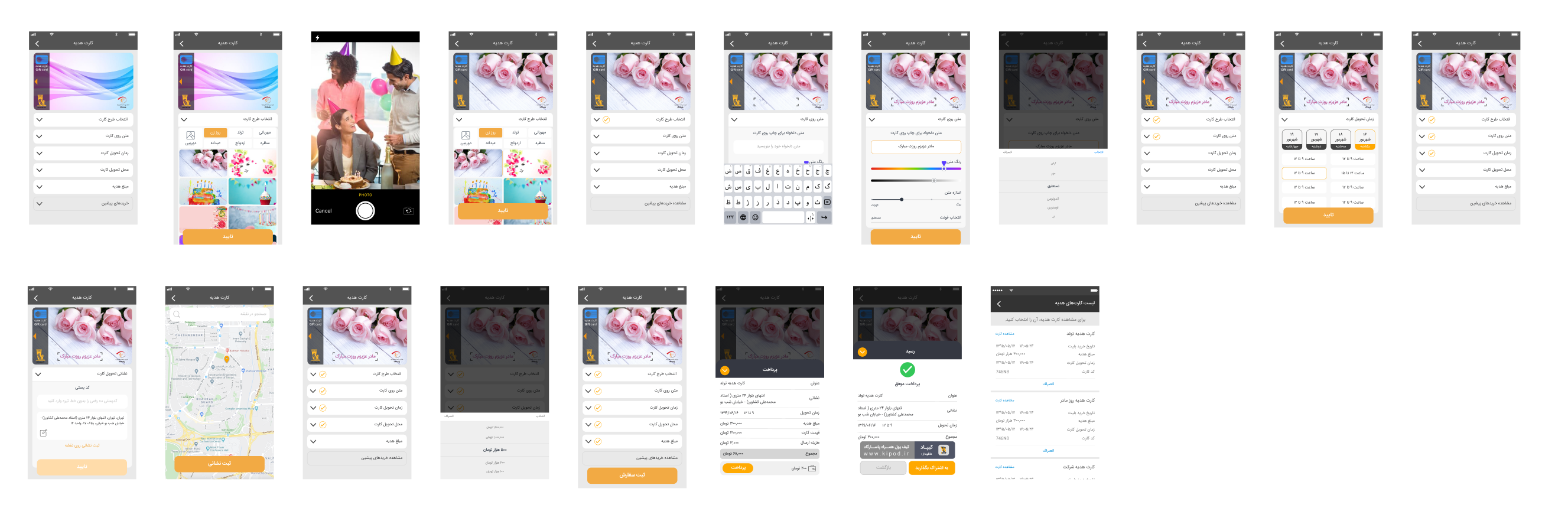
I was responsible for the UX design of the PayPod app, ensuring a seamless and intuitive user experience.

Design Process

  • Conduct user interviews and surveys.
  • Observe user interactions with the current app.
  • Gather qualitative data through focus groups and user feedback.
  • Define problem statements and key insights.
  • Prioritize user pain points to address.
  • Facilitate brainstorming sessions and workshops.
  • Use techniques such as mind mapping, sketching, and card sorting.
  • Encourage diverse perspectives and creative thinking.
  • Develop low-fidelity prototypes and wireframes.
  • Iterate on designs based on initial feedback.
  • Focus on rapid development and user interaction.
  • Conduct usability testing sessions.
  • Collect and analyze user feedback.
  • Iterate designs based on testing results.
RESEARCH & DISCOVERY

Understanding User Behavior

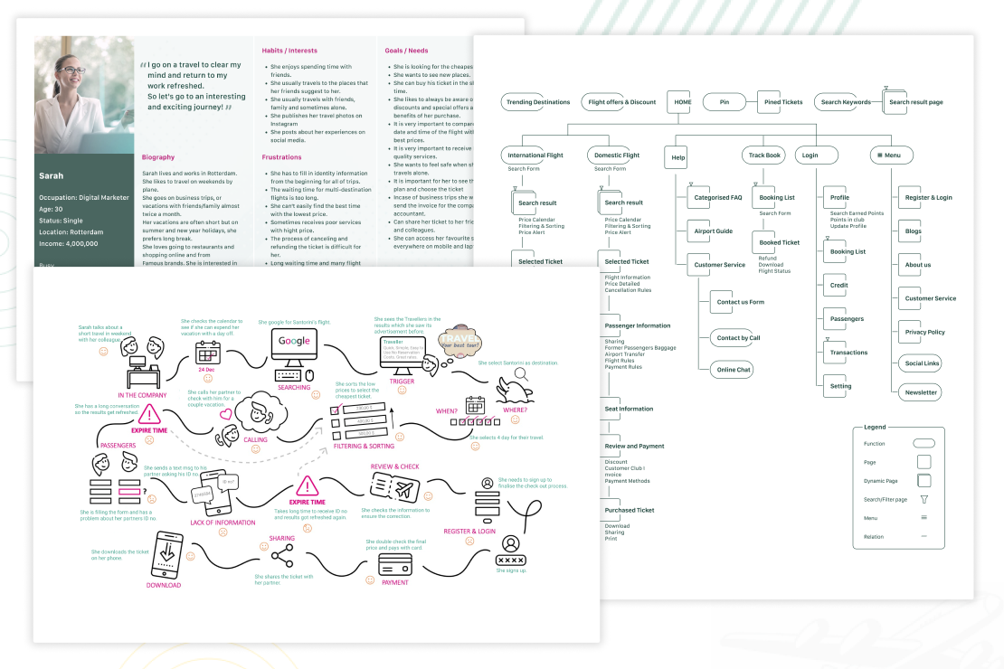
This phase ensures that the solutions are user-centered, addressing real problems with meaningful and effective designs.
My goal was to gain a deep understanding of how users interact with the app's various payment services, identify common challenges they face, and gather insights on how we can enhance their overall experience. This foundational work is essential for creating a user-friendly, efficient, and cohesive design that meets the needs of our diverse user base.
Methods:

Identifying Frequently Accessed Services

I began by analyzing usage data to understand which services were most frequently accessed.

Usage Data Analysis: Analyzed app usage data from 10,000 active users for one months.

This data provided a clear picture of user priorities and common tasks: mobile recharge, bill payments, and transit tickets are the most frequently accessed services.

This highlights the need to prioritize the usability of these features.

Analyzing Task Completion Times

Focusing on these key services, we then analyzed task completion times and understanding how efficiently users could complete these tasks, after identifying the key services.

Using App analytics: Tracked the time users spent from the start to the completion of each task.

This analysis showed that users were spending more time than expected, indicating inefficiencies in the current design and highlighting areas for potential improvement in navigation and process flow.

Users Overwhelmed by Services:
Users reported feeling overwhelmed by the multitude of services.

User Interviews and Surveys:
A significant portion of users reported feeling overwhelmed by the sheer number of services offered within the app.

User Feedback:
Common feedback indicated that the app's extensive range of services made it difficult for users to quickly find what they needed.
Navigation Struggles
Data revealed high drop-off rates during navigation, indicating users struggled to find and complete their desired tasks, Suggesting users struggled to navigate and complete these tasks efficiently."

User Interviews and Surveys:
Heatmap shows high drop-off rates in the main menu and service access points.

Significant pain point with users struggling to find and access frequently used features.

Pain Points:

Complex Navigation:
Users struggled with navigating through numerous options, leading to frustration and decreased usability.

Service Overload:
The abundance of services created cognitive overload, making the user experience less intuitive and more time-consuming.
hight-fidelity Mockups
Interactive Prototype